
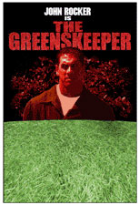
In late May 2002 I was contacted by Tripp Norton, one of the producers of the independent film “The Greenskeeper” to create a theatrical poster for the movie. Working from a basic composition requested by Tripp, I set out to create a movie poster that would provide an engaging color palette and help to convey the essence of the film to the casual viewer in less than ten seconds. The bad part was that I received all of the photographs for assembling the poster less than six days before the movie was set to premiere, so time was already against me. All told, I spent 42 hours working on this project. The final 300dpi Photoshop file came out at a whopping 480MB, and when opened it has at least 30 different layers which makes the file a beast to work inside.
Created almost entirely in Adobe Photoshop 6.0.1 on a blue & white Macintosh G3 tower running OS 9.2 (my production facilities will be switched over to OS X by this time next year). I had to add another 768Mb of RAM to the computer due to the size of the file. The majority of the work was accomplished using a Wacom graphics tablet. No special third-party filters were used on this project. I handed off a flattened version of the file to Adam around Midnight on Wednesday night so that he could drop the file off to be printed on Thursday allowing enough turnaround time for the posters to be put in place for the Friday Premiere. And they looked great.
Step One : Composition
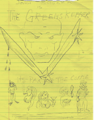
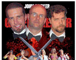
I had several conversations with Producer Tripp Norton regarding the tone of the film, which he described as ‘Caddyshack’ meets ‘Psycho’. He already had a basic composition in mind: titular star John Rocker’s face framed by gardening shears set above representations of the various characters from the golf/tennis club. Tripp’s sketch (shown on right) suggested that the shears might have glints of light and possibly be coated in or dripping with blood. During my production of the poster he decided to refrain from showing blood, so you’ll note that the shears in the final poster show no traces of blood…that layer is turned off.
Tripp secured the services of photographer David Stuart (www.davidstuart.net) to shoot the characters against a flat lit with blue light. The final photos were drum-scanned at 300dpi and burned to CD.
Step Two : Making An Evil Red Rocker
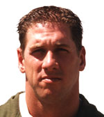
Unfortunately, the only photograph they could provide to me of the ex-Atlanta Brave was noticeably out of focus and had a lot of strong shadows on his face, as he’d been photographed with the noonday sun almost directly overhead. He looked more bored than menacing, so I spent some time giving him some digital evil. The first step in tweaking his hound-dog expression into a classic evil-guy stare was to move his brow downward toward his nose just a bit. Next, I replicated his lower lip and drifted down one corner to give him a sneer. The problem was I needed some teeth to stick into his now-open mouth. I grabbed my digital camera and snapped some shots of my own teeth, noting in the process that I was two months late for my last cleaning (yikes!). Back in Photoshop I fitted my own teeth into place and adjusted the color and saturation to match that of the photograph. Finally, I colorized John’s altered face to a red hue and added a lot of graininess to sell that feeling of ‘evil’. A couple of small red glowing orbs in his eye sockets made him look feral….completing the process of recovering a usable image from a marginal photograph. Red Rocker complete!
Step Three : Adding The Grass
The title has a slightly shaggy look to it due to a myriad of red grass blades growing out from the letters. The grass that I used for the title is a from a digital photograph I made of the sod that I had planted on top of my cat’s grave… it died a week before I began working on this poster. Once the photograph was colorized and cleaned up, I spent almost five hours painstakingly painting out a masking layer to reveal the blades of grass extending beyond the edge of the letters. I had this idea from day one but wanted to see if it looked right before I showed it to anyone. Once I’d completed three letters I knew that I was onto something and was ready to start showing it in the progress prints I was emailing back to Tripp. The use of grass in the title itself helps to marry the top of the poster to the bottom while quietly helping to establish that this is a movie set primarily around a golf course.
The lawn itself is the same photograph of my cat’s grave, this time colorized a nice healthy green. By this time I had a strong notion about how I was going to arrange the characters along the bottom of Rocker and felt that I needed to establish a sense of depth to the poster to help make it POP out at the observer. So I stretched the flat photograph of the grass into perspective. I could have shot a nice lawn with proper perspective, but I wanted to give the poster a slightly artificial feeling. A real lawn shown in proper perspective wouldn’t have the level of texture that I could give to the poster by using the grass like a texture-map in a video game and I’m happy that I decided to go this route.
Step Four : Country Clubbers In The Mist
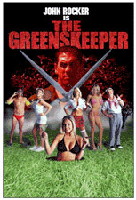
This is the stage that took a huge chunk of my time. David Stuart had photographed the models against a backdrop lit with blue light which helped me to quickly isolate them as individual elements, but the blue light also showed up along the edges of their clothes, skin and hair….especially when they were placed against the red, green and black of the poster. So I had to go into each model’s image and manipulate their color space to look as if they were receiving reflected light in the color of the new background. I have about 10 or 12 hours invested in that step.
The Martini Girl had posed a problem for me from the beginning in that she was the only model who hadn’t been shot full-figure. She was the first figure that I cleaned up and I just knew that she’d look like she was coming out of a hole when compared to the other models….and my very next thought was to have her IN a golf cup. It was obvious, and it worked out great. That little touch says ‘comedy’, which is what’s going to pull in a more mainstream audience.
The characters didn’t stand out very well against the dark background above the green lawn, and I really didn’t want them to blend into Red Rocker. The solution was to introduce a flowing white fog along the horizon line. Fog is scary.
Step Five : The irRegular Guys
A local Clear Channel Atlanta radio station, 96 Rock, has a morning show called ‘The Regular Guys’ starring Larry, Eric and Southside Steve. Early into the film’s production these guys got involved with the film and talked about it a lot on the air. With the bully pulpit of their radio show they helped to push the film into the headlights of the mainstream media, all the while making sure that listeners knew that THEY were going to be in the movie. I decided to ‘honor’ these three by hiding them (along with some other things) in the finished poster. Don’t waste your time trying to find their pictures…I’m a professional.
Step Six : The Tagline, The Credits And The MPAA Rating
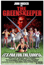
Tripp explained that the tagline that they’d been using all along was “It’s par for the corpse”. He originally wanted me to put that tagline between Rocker’s face and the people below, but my design had evolved into a single piece of artwork that wouldn’t accomodate the tagline in the center. There was a nice big spot underneath Martini Girl, so I made the tagline in a very legible typeface then gave it a perspective to match that of the lawn. Then I floated it on top of the lawn by adding a drop shadow beneath it. Finally, I added a slightly dimpled effect to the lettering, an allusion to the texture of a golf ball.
The film’s credits were emailed to me and were one of the last things that I added to the poster. They too received the perspective treatment, which really helps to activate the poster and invites the observer to explore the image. I looked around the web for an EPS or Illustrator file of the MPAA’s ratings but came up empty (hey, MPAA, what’s the deal?). So I had to take a low-res example from the MPAA’s website and replicate it in Adobe Illustrator then move that file into the poster’s file.
There’s the story about the time I built a Movie Poster, hope you enjoyed it as much as I did~